Showing posts with label Data visualized. Show all posts
Showing posts with label Data visualized. Show all posts
Saturday, January 2, 2010

Sunday, September 20, 2009
abandoned man-made creations
Artificial Owl documents man-made structures that have been abandoned and are now littering the planet. The site includes google maps links and other interesting historical information. Here are some ships where once Aral Sea was:

Or how about an entire Mexican village that was buried by lava. All that's left is a church sticking out from the hardened volcanic remnants:
Wednesday, September 2, 2009
moonbell; music from above;
Moonbell is a music generator. It generates music based on lunar topographical data obtained by Japan’s Kaguya (SELENE) explorer between late 2007 to June 2009.

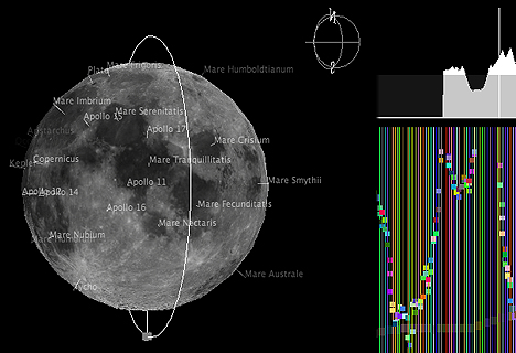
Launch Moonbell
[use IE, if FireFox or Safari do not work]
Monday, August 31, 2009
can we still nuke the world?
I grew up in the Soviet Union. In the 80s. A nuclear attack was something we were being prepared for in school. There were nuclear shelters around the city, and we all had to take a class or two about what to do in the event of a nuclear war. I remember watching The Day After and being utterly horrified (can you believe it -- they showed it on Soviet TV in the late 80s!?).
So what's up with the atomic bomb now?
Can the world still be destroyed with a push of a button or two?
Evidently, other people think the same paranoid thoughts. The Guardian just regurgitates a timeric graph. This is other than satisfying to the information is beautiful blog, so the folk(s) over there decided to figure out how many nuclear weapons would it take to destroy the world and whether we have enough.
So what's up with the atomic bomb now?
Can the world still be destroyed with a push of a button or two?
Evidently, other people think the same paranoid thoughts. The Guardian just regurgitates a timeric graph. This is other than satisfying to the information is beautiful blog, so the folk(s) over there decided to figure out how many nuclear weapons would it take to destroy the world and whether we have enough.
total eclipse of the heart; a cultural study
I am not sure why, but the stars have aligned and I know more about Total Eclipse of the Heart as performed by Bonnie Tyler than I really want to... so here... I can share...
1. Total Eclipse of the Heart... Flowchart styley (via flowingdata):
 2. ... and if this wasn't enough, here it is, literal styley (via Mr Wind):
3. ... and the original (via youtube):
1. Total Eclipse of the Heart... Flowchart styley (via flowingdata):
 2. ... and if this wasn't enough, here it is, literal styley (via Mr Wind):
3. ... and the original (via youtube):
Saturday, August 29, 2009
where are the haters at?
Southern Poverty Law Center tells you where the hate groups are in the United States. Evidently most of them reside in California.
Wednesday, August 26, 2009
kennedy family tree;
Washington Post has a nice visualization of the Kennedy Family Tree. I consider this in light of its publishing date. Jean Ann is the last of that generation.
Friday, August 21, 2009
how do you spend your day?
New York Times has a nice stacked visualization of how different groups of people spend their day. Of course, the unemployed are the outliers.
Sunday, August 16, 2009
Thursday, August 6, 2009
Mirror mirror on the wall
Nathan shows you the trends in the data you provide about your own behavioral / living patterns. I plan on trying it. I think.
Subscribe to:
Posts (Atom)


